HOME » BLOG » COLOR HYPERSENSITIVITY

COLOR HYPERSENSITIVITY

WHEN THE WORLD BECOMES INACCESSIBLE
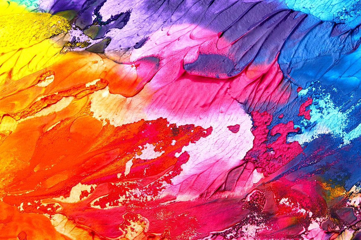
Color hypersensitivity is something I rarely if ever see talked about. Yet it’s easily one of the most disabling aspects of my autism for me. Other sensory processing problems do add to this. Especially visual clutter. But even with additional stimuli removed, color alone is an issue.
When I see colorful things I get overloaded. My eyes get strained and achy, my vision gets blurry, I get headaches, even migraines, I get dizzy. The severity of these symptoms varies depending on a variety of factors. But I can’t ever look at colorful things and just enjoy them. It’s always at the very least an exhausting experience.
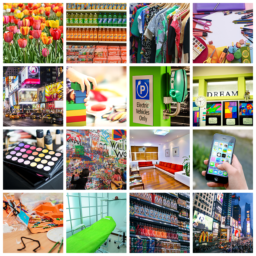
In the man-made world, color is everywhere. There seems to be this need to cover up every free bit of space. I can’t leave my home without being assaulted. Color is in people’s clothes. It’s in every storefront, and don’t even get me started on the inside of stores. Cars are colored. Houses are colored. Street art, graffiti, billboards everywhere. Colors that blink, move, change.
Even when avoiding the outside world and roaming online – colors everywhere. Websites, backgrounds, logos, videos, gifs, emojis, photos, it never ends.
One place that offers some relief is nature. This is likely why it grounds me so well. But even in nature, I can struggle – who doesn’t love a field full of beautiful blooming flowers in spring, bright blue sky, and some sunshine, right? Me, that’s who.
I can see the beauty in certain colorful things. Sadly it’s always overshadowed by the harm it causes me.
WHAT I NEED

WHAT THE WORLD IS LIKE

THE TECHNICALITIES OF MY COLOR HYPERSENSITIVITY
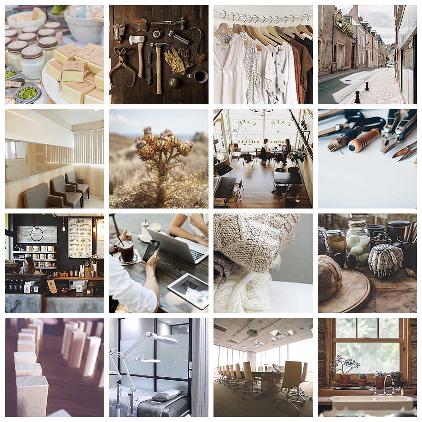
Shades of brown, grey, white, and black are best. Forest greens are okay too. Most greens are still better than the other remaining colors. Shades of red (including pink) and neon colors are the worst.
Out of what’s left, the darker or more muted and neutral the color the easier it is to cope. The brighter and bolder the color, the harder it gets.
For combinations of colors the more similar the colors the better. The higher the contrast, the harder it gets. Also the more different colors the harder it gets.
For patterns, stripes are especially bad. Anything in rows or columns is harder than floating patterns on a solid background.
The more of these bad things are combined, the harder it becomes for me to cope.
MY HOME IS MY SAFE SPACE
At home I can control a lot of the colors I get subjected to.
I try to only buy clothes in shades of brown, dark forest green, grey. Panties, bras, socks, T-shirts, sweaters, jackets, gloves, scarves, hats, shoes, every single item. Non-clothing items too. Bags, my glasses, ear defenders, sunglasses.
I try to only buy fabrics for our home in shades of brown, dark forest green, grey. Bedsheets, curtains, carpets, pillows, chairs, towels, shower curtains.
I try to take as many things as I can out of their original packaging and use milder alternatives. I use a wooden bamboo toothbrush, white tooth brushing tablets in a tiny mason jar, a white bar of soap, and white shampoo that I squeeze into a glass bottle.
I made beige fabric curtains to cover our shelves so that the colored chaos inside is hidden from view most of the time.
We have white walls and no pictures or posters up.
Our furniture is wooden and not painted.
I make or alter a lot of things myself because the store-bought versions are sensory hell.
My online presence is a safe space for me as well. The colors I choose here are accessible for me (with this post being an obvious exception). This allows me to participate without unnecessary harm.
But there are things I can’t control even in my own home. Especially packaging. Companies tend to make their packaging bright and colorful in an attempt to grab buyers’ attention. Of course, this usually fails completely because everyone makes their packaging bright and colorful. So I just end up in a world full of bright colorful packaging. Thanks a lot.
A LOT OF EXTRA TIME AND EFFORT
One aspect of color hypersensitivity is that every single thing I buy requires extra attention.
I often have to buy items that harm me because we need them and an accessible version isn’t available, I’m unable to research at the time, or it isn’t affordable.
Shopping in stores is one overloading experience of colors, chaos, light, sound, smell, and people. I also just usually can’t find items that work for me anyway. So I shop mostly online. I spend hours wading through overloading images of products online to find the ones that work for me.
COLOR IS AN ACCESSIBILITY ISSUE
Most people aren’t even aware that color hypersensitivity exists, and that is in itself a huge problem. I often get dismissive, harmful comments, if I point out the inaccessibility of something color related.
I understand that many people love colors. For most, it makes places more inviting, friendlier, and that’s perfectly valid. So I avoid the world as much as I can. However, there are things I can’t simply avoid.
Especially anything related to health care like doctor’s offices, hospitals, and therapy and treatment centers of any kind. Finding accessible places to get healthcare is difficult. And if I have to be in a harmful environment, I will likely suffer physical harm because of it.
Another thing is educational environments like schools, classrooms, conference venues, convention centers, and so on and so forth. Tools like books and software can also be a huge problem.
And finally, most dear to my heart: anything related to autism. Events, websites, educational material, venues, photos, videos, logos – colors everywhere.
I love the infinity symbol as a symbol for autism – but the second it’s depicted in rainbow colors, it’s inaccessible for me. I love a counter-campaign to “Light it up blue” – but the second it becomes “Red instead” it’s inaccessible for me. I love when organizations get rid of harmful symbolism like puzzle pieces – but the second they replace it with a brightly colored logo it’s inaccessible for me.
I do wish I could just enjoy color. But I can’t. Maybe this can help people understand. It would mean so much to me if people could be mindful of how they use color. Especially in official and professional contexts meant to be accessible.

Hi,
To me, it seems “more normal” to like natural colors in the proportion that they occur in nature, than artificial screaming colors and color combinations. Thus, I find it “the world upside down” that the natural tendency is diagnosed as an anomaly.
Kind regards,
lutgart frans
Great blog about colour sensitivity and accessibility. It’s really important that people consider this when looking at making spaces more accessible which is what I am most likely to be involved in. Thanks